
RATIO — 60–30–10 Color Balance Tool
A visual tool for exploring the 60–30–10 color principle — how much of an interface each color should occupy — with accessibility checks and real interface previews built in.
Context
Most designers can shortlist colors that look good together — the harder question is how much space each one should occupy. RATIO set out to make the classic 60–30–10 interior-design color principle usable for interface work, deliberately without AI generating the palette for you.
The Challenge
The product needed to make an abstract ratio feel concrete — showing not just percentages but where each color role actually belongs in a real interface — while staying strictly a decision-support tool rather than a generator that picks colors on someone's behalf.
Research
Traced the 60–30–10 rule back to its interior-design origins — one dominant surface, one supporting color, one used sparingly — and used that as the frame for translating it into interface color roles rather than inventing a new model.
Insights
The key findings that shaped the direction.
Designers don't need colors generated — they need where clarified
Most people opening a color tool already have candidate colors in mind; what's missing is a clear answer to how much space each one should take, not a fourth option to choose from.
Balance and legibility are two separate questions
A palette can be proportioned perfectly and still fail someone with a color-vision deficiency — the tool needed to check both independently instead of folding accessibility into a single 'looks good' score.
Seeing colors in a real interface beats seeing swatches
A color ratio means little as three flat blocks — the Interactive Color Inspector, letting someone click through a real Marketing, SaaS or Editorial layout, is what makes the abstraction concrete.
Design Strategy
How decisions were made.
Visualise the ratio before anything else
Led with a direct 60/30/10 bar showing Dominant, Secondary and Accent proportions, so the core idea is legible in the first five seconds without any explanation needed.
Let people click through a real interface, not swatches
Built an Interactive Color Inspector across five real contexts — General Product, Marketing, SaaS, Pricing, Editorial — so each color role is seen doing an actual job, not sitting in an isolated chip.
Separate balance from legibility, explicitly
Ran WCAG contrast checks and protanopia, deuteranopia, tritanopia and grayscale simulation as a distinct pass from the ratio visualisation, so a well-balanced palette that fails accessibility can't hide behind a good-looking ratio.
Refuse to generate colors on the user's behalf
Deliberately left color choice to the designer — RATIO explains and checks a palette rather than producing one, keeping the deliberate, designer-led decision at the center of the product.
Build solo, with AI as the engineering partner
Designed and built end-to-end using Claude Code as a development partner — from the Color Inspector to the accessibility-simulation engine — without a dedicated engineering team, while keeping every design-principle decision in my hands.
Solution
A browser-based color-balance workspace applying the 60–30–10 principle to interface design, with an interactive real-interface inspector, WCAG and color-vision accessibility checks, and export to CSS, JSON, SVG or PNG.
A look at the work.
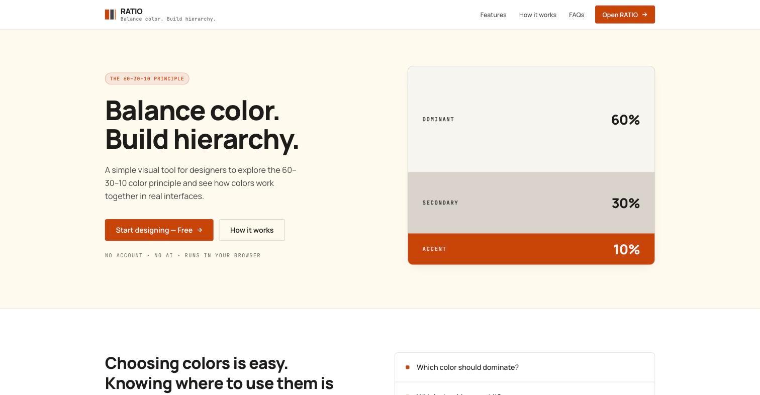
The live product at getratioapp.vercel.app.
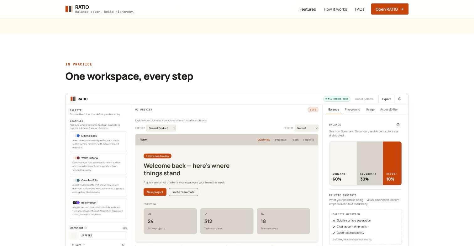
The full workspace — palette, live interface preview, and balance, playground, usage and accessibility tabs.
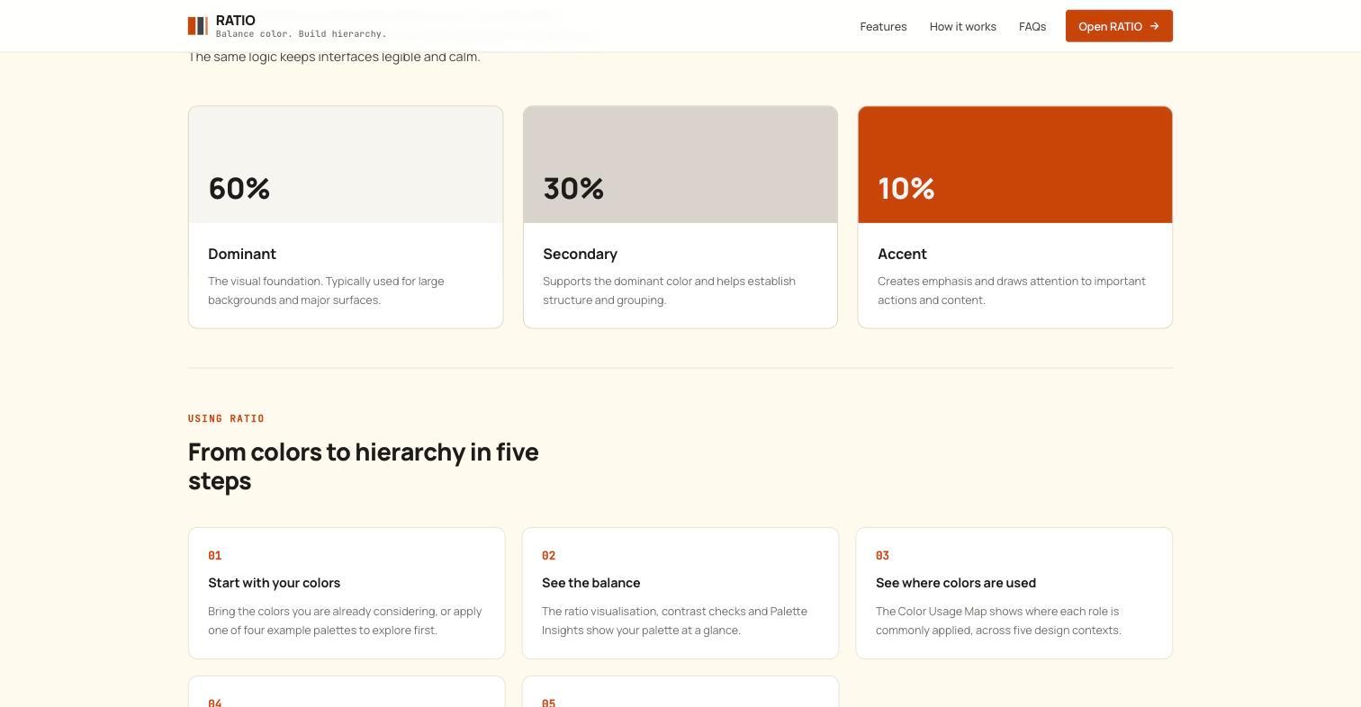
The 60–30–10 principle broken into Dominant, Secondary and Accent roles.
Design System Thinking
This project wasn't designed as a one-off — here's how it connects back to the system.
Components
A shared ratio-bar component (role, percentage, color) reused across the hero, the workspace summary and every example palette.
Tokens
The Dominant/Secondary/Accent role language applied consistently across the inspector, the playground, the usage map and every export format.
Patterns
A context-switching pattern — the same palette previewed across five interface types — reused between the Color Inspector and the Color Usage Map.
Governance
Runs entirely in the browser with no account and no AI-generated colors, keeping every color decision attributable to the designer using it.
Impact
RATIO shipped as a free, deliberately non-generative alternative to AI palette generators, giving designers a way to test and defend a color balance rather than accept one a model produced.
Reflection
The easiest version of this product would have generated palettes with AI, and that was a deliberate line I didn't cross. Staying a decision-support tool rather than a generator kept the scope honest, even though it meant more design work explaining the 'why' behind every panel.