
Parking Permit — Customer Portal
A redesign of the UK council parking-permit application portal, moving it in-house and rebuilding it around users aged 18 to 70 with wildly different comfort with technology.
Context
The Parking Permit Customer Portal lets the public apply for and purchase parking permits specific to individual UK councils, each with its own rules and restrictions. The existing portal was confusing and outdated, and had long been run by a third-party provider at rising cost. MarstonHoldings made the call to bring development in-house, both to fix the user experience and to respond to user needs faster than an external vendor relationship allowed.
The Challenge
The portal had to serve residents from age 18 to 70 with very different levels of technology comfort, alongside internal MarstonHoldings staff and council employees managing applications — all through one interface, without a login wall discouraging casual users. Regulatory compliance varies by council, and the offshore development team added its own coordination overhead on top of an already tight timeline.
Research
Ran a large-scale survey alongside a personal heuristic evaluation and cognitive walkthrough to separate what users said frustrated them from what independently, measurably failed — then used 12 in-depth interviews to understand the why behind both.
Insights
The key findings that shaped the direction.
The portal was failing on its own terms, not just by user report
70% of surveyed users found the portal confusing, and a cognitive walkthrough independently found a 60% task-completion failure rate — the complaints and the measured usability problems agreed with each other.
One portal has to work for a teenager and a retiree
Personas ranged from a 24-year-old junior professional to a 65-year-old retired teacher who prefers face-to-face help over online forms — the interface couldn't assume a single baseline of digital confidence.
Bulk and single applications are different jobs
A corporate manager handling permits for an entire fleet needs efficient bulk workflows and reporting; a parent applying for one permit needs speed and clarity — conflating the two made both worse.
Design Strategy
How decisions were made.
Run a 4D cycle: Discover, Define, Design, Determine
Structured the whole redesign around understanding context of use, specifying user requirements, designing solutions and validating with users, repeating the loop rather than shipping one linear pass.
Design for the widest possible age and skill range
Built personas spanning a 24-year-old professional to a 65-year-old retiree with low tech confidence, and stress-tested every flow against the least tech-comfortable persona, not the most.
Split resident and business flows early
Separated the fast, single-permit resident journey from the bulk-application, reporting-heavy business journey at the information-architecture level, rather than bolting bulk features onto a consumer flow.
Bring the system in-house, not just the interface
Paired the visual redesign with a genuine in-house management system and support for onboarding additional councils, since the underlying cost and speed problem was as much operational as it was UX.
Solution
A responsive customer portal redesign covering permit and licence homepages, account and payment management, and a full mobile app IA — moving from wireframes through to high-fidelity Figma prototypes ready for handoff.
A look at the work.
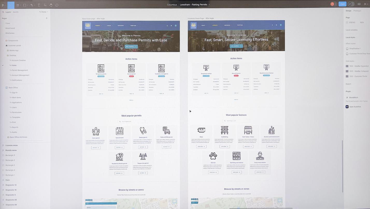
Parallel homepage designs for permits and licences, sharing one visual system.
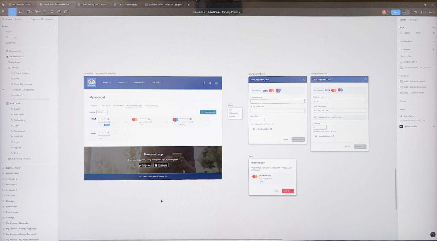
Account and payment management — saved cards, renewals and permit history in one place.
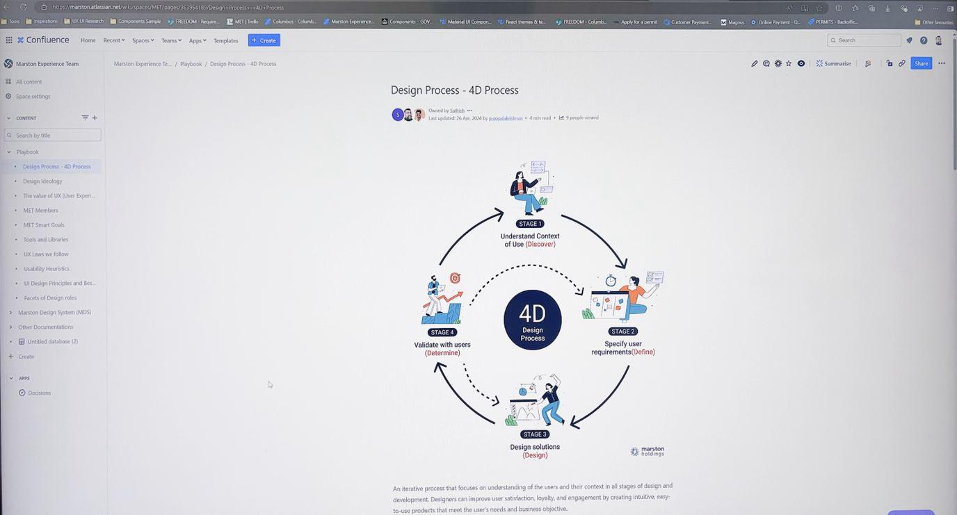
The 4D process used to structure research, design and validation.
Design System Thinking
This project wasn't designed as a one-off — here's how it connects back to the system.
Components
A shared library of permit and licence cards, action-item tiles and account panels, documented in Confluence for the offshore development team to build from directly.
Tokens
A defined brand colour palette with a contrast-grid check built in, plus a responsive grid system specified down to phone, tablet and desktop breakpoints.
Patterns
A repeatable homepage pattern — hero, action items, popular options, browse by location — reused across both the permits and licences experiences.
Governance
Design decisions cross-referenced against established UX laws (Fitts's Law, Jakob's Law) documented in the team's playbook, so choices could be justified against a named principle rather than personal preference.
Impact
As a project still in progress, the redesign has shipped as a full set of design specifications, a documented design system and validated wireframes handed to development — with 80% user satisfaction, a 30% increase in completed applications and a 40% reduction in task completion time set as the targets for post-launch measurement.
Reflection
Surveying 1,500 users gave this project a research base most redesigns don't get, and it shaped real decisions. If I were running it again, I'd push for more iterative testing rounds before handoff and more structured training time for internal users — both flagged as gaps precisely because the research base was strong enough to expose them.