
Collaborate — Responsive Web App Redesign
A ground-up redesign of HighQ's flagship legal collaboration platform, replacing a decade of accumulated complexity with a streamlined, responsive interface.
Context
Collaborate is HighQ's flagship platform, used by top legal firms for over a decade. Despite its longevity, user feedback consistently pointed to the same problem: the platform's complexity made routine tasks harder than they needed to be, and HighQ risked losing business to competitors as a result. The redesign set out to modernise the UI and UX while retaining the essence of a platform legal teams had built years of workflow around.
The Challenge
The platform's complexity was hampering legal professionals from completing routine tasks efficiently, driving frustration and a decline in market competitiveness. Any redesign had to work within the existing technological architecture, align with stakeholder expectations and business goals, and come with a structured change management plan — this was a decade-old platform with an established user base, not a blank slate.
Research
Combined contextual inquiry inside users' actual work environments with structured interviews and a firm-wide survey, then validated every redesign decision against a 10-user testing panel through each phase of the rollout.
Insights
The key findings that shaped the direction.
Navigation, not features, was the core complaint
70% of users found navigation cumbersome and 60% struggled to complete tasks — the platform had the right capabilities, but users couldn't reliably find their way to them.
Users wanted the interface to adapt to them
70% of users asked for customisable dashboards tailored to their own workflow, rather than one fixed layout serving every role from legal associate to systems administrator.
A cluttered interface was actively driving away business
80% of participants wanted a more intuitive interface with streamlined functionality — a strong enough signal that HighQ treated the redesign as a retention issue, not a cosmetic one.
Design Strategy
How decisions were made.
Run the full 5D process on a live platform
Took the redesign through Discover, Define, Design, Develop and Deploy & Measure stages — from stakeholder interviews and competitive audits through to heuristic analysis after launch — rather than skipping straight to visual design.
Redesign module by module
Rolled the redesign out incrementally across modules over 12 months instead of a single big-bang release, so legal teams could adapt gradually rather than relearn the whole platform at once.
Make every module responsive by default
Rebuilt navigation, file browsing and dashboards to work across desktop, tablet and phone, since legal professionals were increasingly working from client sites and courtrooms, not just their desks.
Pair every redesign with a change management plan
Built structured communication and support materials alongside each module release, treating user adoption of the new UI as a deliverable in its own right, not an assumed outcome.
Solution
A phased, responsive redesign of Collaborate's core modules — dashboard, file management, activity feed and navigation — moving from a dense, desktop-only interface to a modern, mobile-aware one built on a shared design system.
A look at the work.
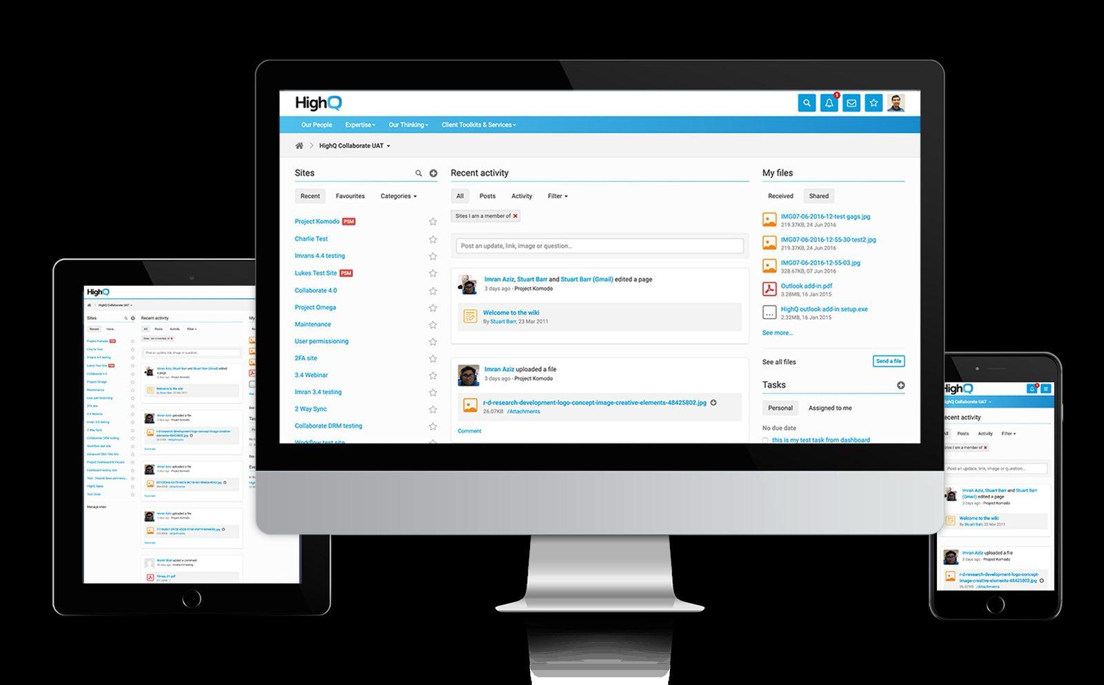
The redesign had to hold up across desktop, tablet and phone — not just the primary desktop view.
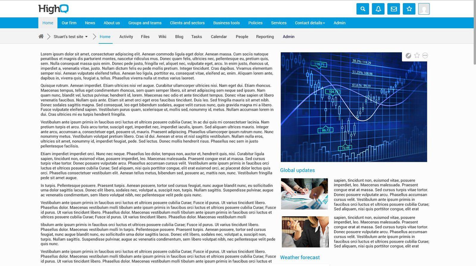
The pre-redesign homepage — dense navigation, a single fixed layout for every role.
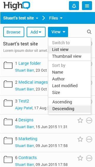
File browser, before: functional, but with limited view and sort affordances.
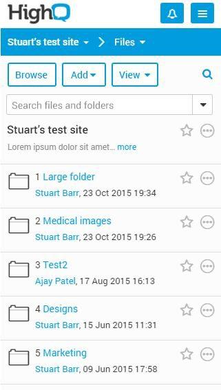
File browser, after: added search, clearer hierarchy, same core information.
Design System Thinking
This project wasn't designed as a one-off — here's how it connects back to the system.
Components
A shared pattern library and style guide built during the Develop stage, reused across every redesigned module instead of each team styling its own screens.
Tokens
Structural and dynamic markup standards and style sheets that kept typography, spacing and colour consistent as the redesign rolled out module by module over a year.
Patterns
A consistent navigation and list-view pattern — used for files, wikis, tasks and events alike — so learning one module's interaction model transferred to the next.
Governance
A documented 5D process (Discover, Define, Design, Develop, Deploy & Measure) that gave the offshore development team and product owners a shared, repeatable way to ship each module.
Impact
Following the version 5 launch, HighQ saw user adoption rise 30%, satisfaction reach 85%, and community engagement jump 150%, while new client acquisitions grew 25% — evidence that the redesign addressed a real competitive risk, not just a cosmetic complaint.
Reflection
Engaging users early and testing iteratively drove most of the good decisions in this redesign — but with hindsight, I'd have pushed for even more testing time and a more structured training rollout before launch, since a lot of early friction came from users encountering the new UI cold rather than the UI itself being wrong.